Design System
2020
Product Designer
Web Data Extraction
There's a particular kind of chaos that grows quietly inside fast-moving product teams. It doesn't announce itself. It just shows up one day when you open a Figma file and realize there are eleven slightly different versions of the same button and nobody knows which one is right. That was the reality at Zyte. A product growing fast, a distributed team, and a UI built piece by piece with no shared foundation. I built their first design system in Figma. One place for components, patterns, and templates so the whole team could stop repeating themselves and start shipping things that actually felt like they belonged together.
70%
Faster setup
1st
Zyte Design System
Figma
Primary tool
2020
Year
70%
Faster setup
1st
Zyte Design System
Figma
Primary tool
2020
Year
70%
Faster setup
1st
Zyte Design System
Figma
Primary tool
2020
Year
CHALLENGE
Scaling Design for a Growing Product
Designers were solving the same problems every sprint. Developers were interpreting specs differently. New team members had no single place to learn how the product was supposed to look and behave. The result was a product that felt pieced together because it kind of was. The fix wasn't just a component library. It was a living system everyone could trust.
Duplicate components, inconsistent spacing, interactive states that behaved differently depending on who built them.
DESIGN PROCESS
How I Approached This Project
01
Audit existing UI
Catalogued every component, pattern, and style in use.
02
Talk to developers
Listened to where handoff broke down and what they wished existed.
03
Reference Material Design
Adapted Google Material best practices to Zyte's context.
04
Build and iterate
Listened to where handoff broke down and what they wished existed.
RESEARCH
Talking to Developers First
A design system lives or dies by whether developers actually use it. So before I designed a single component, I had conversations with the dev team. Not to show them anything, but to listen. What slowed them down during handoff? Where did they have to make their own calls because the spec wasn't clear enough? What did they wish existed? Those conversations shaped everything that came after. The system wasn't designed for designers. It was designed for the whole team.
Specs weren't precise enough
Developers were making their own calls on interactive states and spacing.
Setup took too long
Every new feature started from scratch. No shared foundation to build on.
No single source of truth
Multiple versions of the same component lived in different files.
Naming was inconsistent
Design names didn't match code names. Translation was a source of error.
RESEARCH
Talking to Developers First
A design system lives or dies by whether developers actually use it. So before I designed a single component, I had conversations with the dev team. Not to show them anything, but to listen. What slowed them down during handoff? Where did they have to make their own calls because the spec wasn't clear enough? What did they wish existed? Those conversations shaped everything that came after. The system wasn't designed for designers. It was designed for the whole team.
Design Solutions
UI and Component Strategy
The system had to live in two worlds: Zyte's marketing brand, established and not mine to change, and the product UI, which needed its own logic built around function, hierarchy, and accessibility. I referred to Google Material Design as a foundation for best practices including component behaviour, spacing systems, and interactive states, then adapted everything to fit Zyte's specific context and brand.

Architecture
Mapped the structure so anyone could navigate the library without a tutorial.

Visual Design
Icons and illustrations aligned with brand and interface patterns.

Button Hierarchy
Five button types, each with a clear role, so users always know what an action will do before they click it.
Design Solutions
UI and Component Strategy
The system had to live in two worlds: Zyte's marketing brand, established and not mine to change, and the product UI, which needed its own logic built around function, hierarchy, and accessibility. I referred to Google Material Design as a foundation for best practices including component behaviour, spacing systems, and interactive states, then adapted everything to fit Zyte's specific context and brand.
Figma Variants, Bridging Design and Code
Each variant was named to match the prop/value format developers were already using in their frontend frameworks. Open the file, read the spec, build it. No translation needed. Every component was annotated with behaviour notes, edge cases, and interaction states. The file was built to answer questions before anyone had to ask them.

Date Picker
Designed with clear spacing and consistent padding so users can scan and select a date without second-guessing what they're looking at, with a tooltip state that surfaces data like extraction counts directly on the calendar.

Extraction Log Panel
A scrollable list view that lets engineers filter and sort their extraction history by time and status, with colour coded indicators so the state of each entry is readable at a glance.

Date Picker Flow
Three interaction states in one component. A single date selection, a tooltip that surfaces extraction data on hover, and a dual calendar range picker with preset shortcuts like Today and Last 30 days. Each state was designed to give engineers exactly the context they need depending on how they want to query their data.
Figma Variants, Bridging Design and Code
Each variant was named to match the prop/value format developers were already using in their frontend frameworks. Open the file, read the spec, build it. No translation needed. Every component was annotated with behaviour notes, edge cases, and interaction states. The file was built to answer questions before anyone had to ask them.
FIGMA VARIANTS

Figma variants mapped to front-end props with annotations for easy developer handoff.
Figma variants mapped to front-end props with annotations for easy developer handoff.
Figma variants mapped to front-end props with annotations for easy developer handoff.
BEFORE
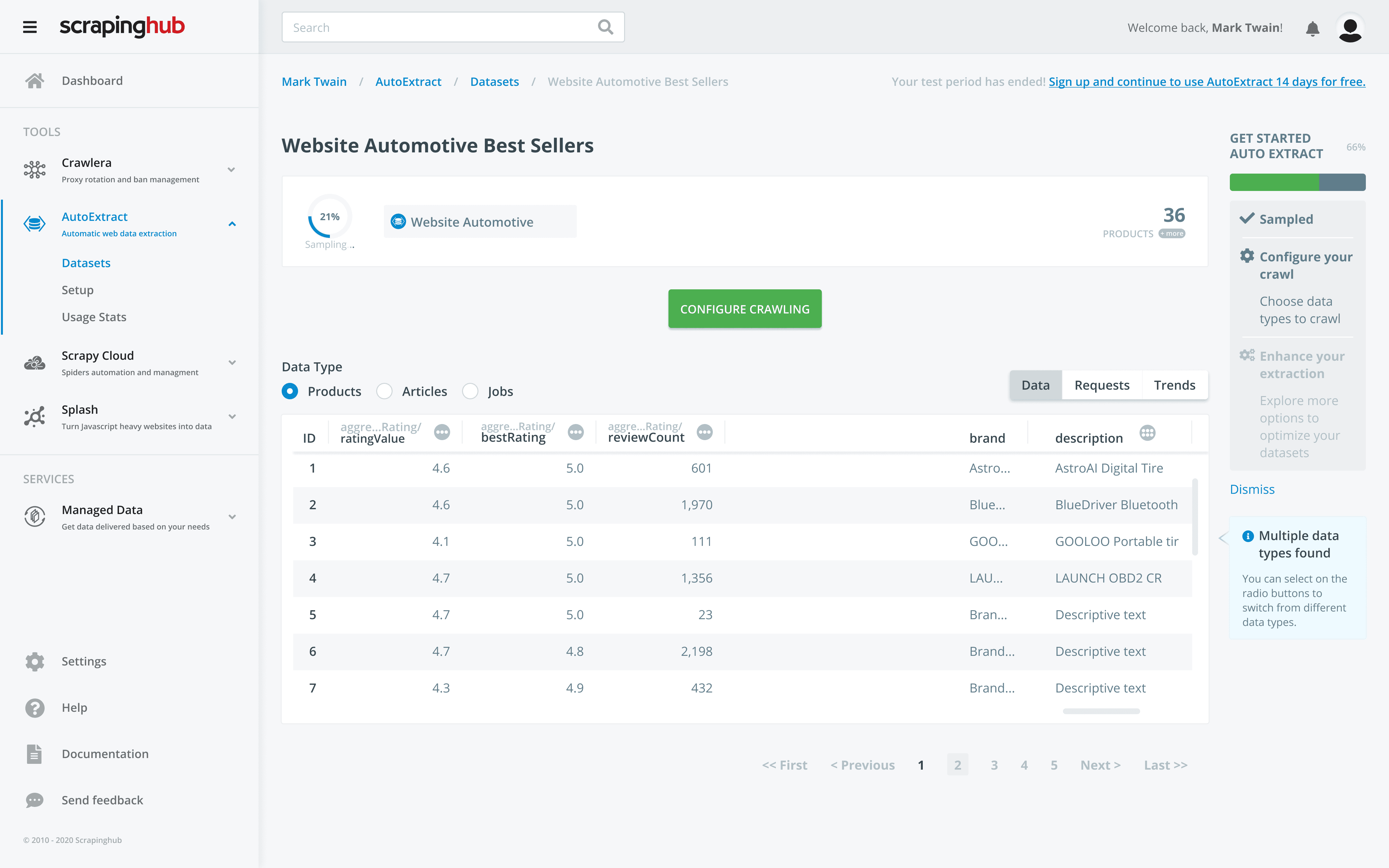
AFTER
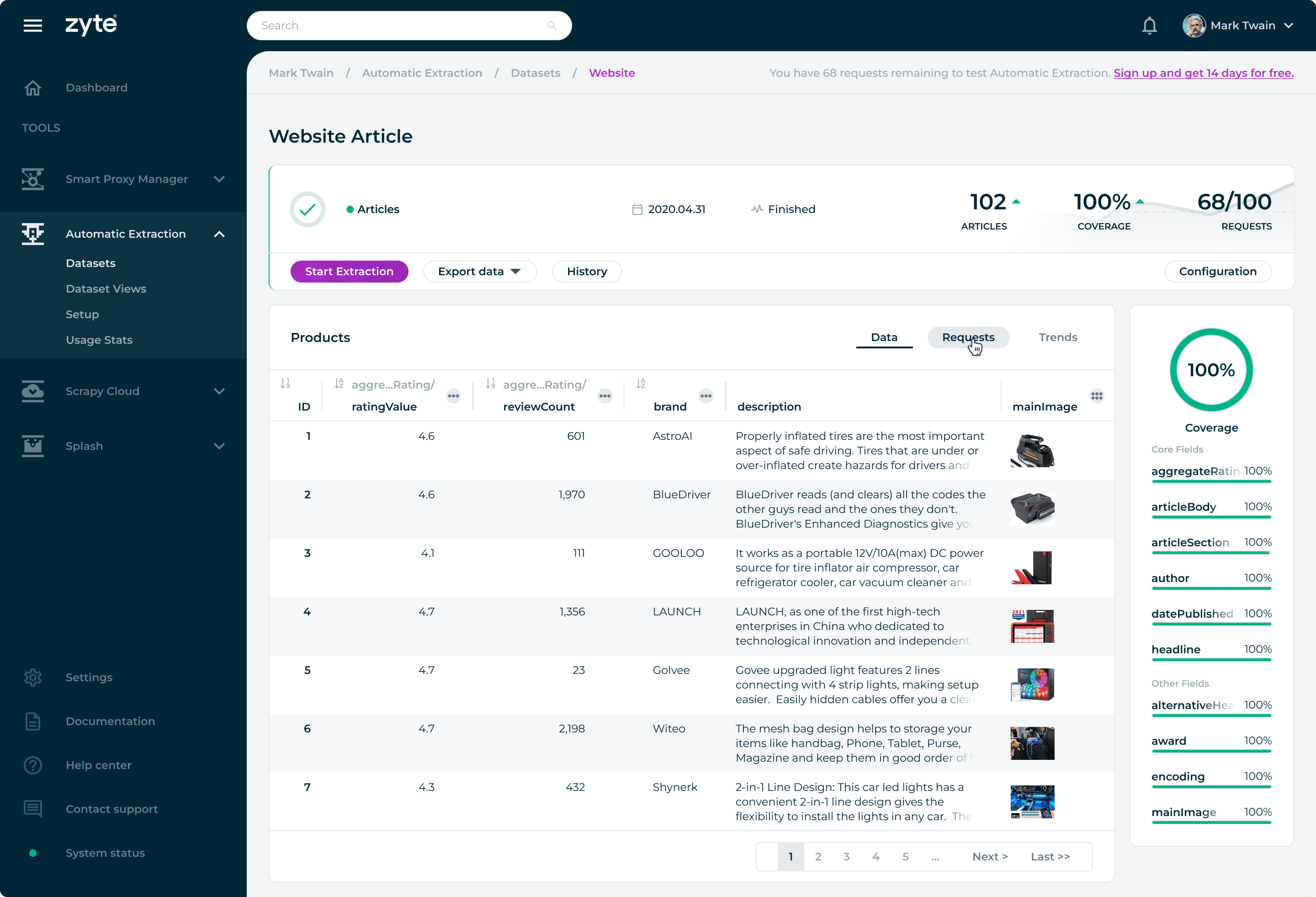
When atoms, molecules, and organisms are combined, templates and pages are formed to show unity and consistency in the user interface with real content in place.
When atoms, molecules, and organisms are combined, templates and pages are formed to show unity and consistency in the user interface with real content in place.
When atoms, molecules, and organisms are combined, templates and pages are formed to show unity and consistency in the user interface with real content in place.

Template combining components with real content for seamless design.
Template combining components with real content for seamless design.
Template combining components with real content for seamless design.

© 2026 telo santos
© 2026 telo santos
© 2026 telo santos