
Usage Stats
2022
Product Designer
Web Data Extraction
Zyte is the original and best web data platform. I designed a dashboard for web extraction engineers and developers to understand their usage and requests through data visualization.
Usage Stats
2022
Product Designer
Web Data Extraction
Zyte is the original and best web data extraction platform. I designed a dashboard for web extraction engineers and developers to understand their usage and requests through data visualization.
Usage Stats
2022
Product Designer
Web Data Extraction
Zyte is the original and best web data platform. I designed a dashboard for web extraction engineers and developers to understand their usage and requests through data visualization.
Overview
Making Data Actionable
Raw data is only valuable when it’s easy to interpret and act on. This project focuses on designing a usage analytics experience that helps users quickly understand patterns, monitor activity, and make informed decisions.
Overview
Making Data Actionable
Raw data is only valuable when it’s easy to interpret and act on. This project focuses on designing a usage analytics experience that helps users quickly understand patterns, monitor activity, and make informed decisions.
Overview
Making Data Actionable
Raw data is only valuable when it’s easy to interpret and act on. This project focuses on designing a usage analytics experience that helps users quickly understand patterns, monitor activity, and make informed decisions.
Challenge
Understanding Data Complexity
"An effective dashboard is the product not of cute gauges, meters and traffic lights, but rather of informed design: more science than art, more simplicity than dazzle. It is, above all else, about communication." – Stephen Few (from Information Dashboard Design: The Effective Communication of Visual Data, 2006) The challenge was presenting large volumes of data in a way that remains clear and easy to interpret, without sacrificing depth or flexibility. This required designing for multiple use cases, where users can apply filters, explore different views, and extract meaningful insights without losing context or clarity.
User Research
Information Dashboard Design - User Interview Questions
When designing a dashboard, I split my interview questions into two categories: feature-based and user-focused.
User Research
Information Dashboard Design - User Interview Questions
When designing a dashboard, I split my interview questions into two categories: feature-based and user-focused.

Feature-based questions focus on understanding what specific functionalities users expect from the dashboard. These questions help uncover which metrics, visualizations, and tools are most valuable to the user’s workflow. User-focused questions aim to understand the context, goals, and pain points of the users. These are more open-ended and help reveal the reasons behind user needs. By combining both types of questions, I ensure I’m designing a dashboard that not only offers useful features, but truly supports users' real-world goals and workflows.
Feature-based questions focus on understanding what specific functionalities users expect from the dashboard. These questions help uncover which metrics, visualizations, and tools are most valuable to the user’s workflow. User-focused questions aim to understand the context, goals, and pain points of the users. These are more open-ended and help reveal the reasons behind user needs. By combining both types of questions, I ensure I’m designing a dashboard that not only offers useful features, but truly supports users' real-world goals and workflows.
Design Solutions
Designing for Scanability and Insight
The interface prioritizes quick scanning, using hierarchy, spacing, and visual patterns to highlight key metrics while keeping secondary data accessible.
Gestalt Principles
The speed and accuracy at which users can compare, deduce, and detect particular patterns (alongside numerous other potential functions) ought to serve as the benchmark for evaluating techniques employed in visualizing information.

Grouping features using the law of similarity for buttons, dropdowns, and inputs are perceived to be similar in appearance but function differently. Similarity can be exploited when items cannot be placed within proximity to each other or wouldn't be logical to do.
Grouping features using the law of similarity for buttons, dropdowns, and inputs are perceived to be similar in appearance but function differently. Similarity can be exploited when items cannot be placed within proximity to each other or wouldn't be logical to do.
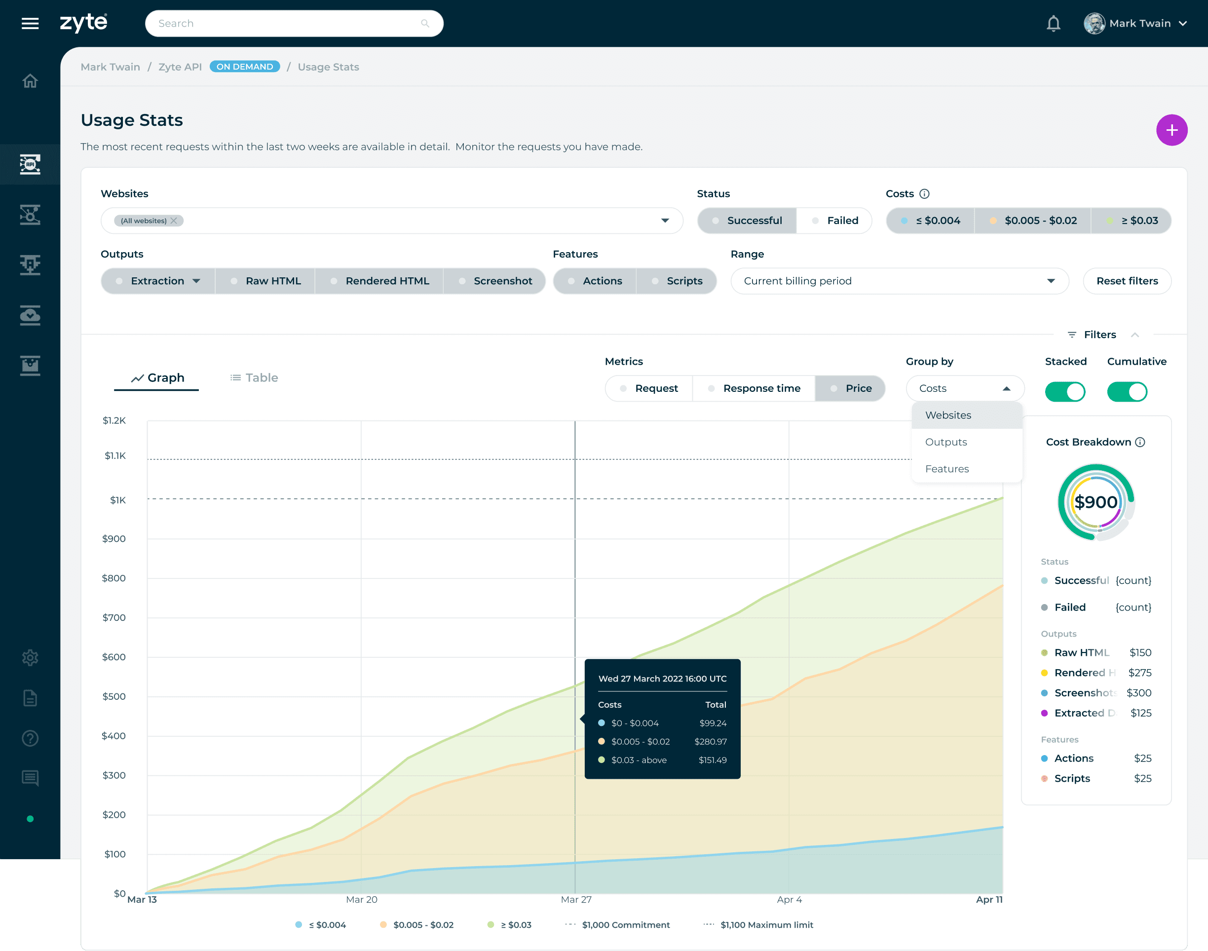
Group by Costs filter is enabled: The Costs button filters are represented by colours to signify the type of data the user chooses to display. The rest of the filters, such as Status, Output, Features, and Metrics, can have a single or multiple selection of datasets to visualize the results in the center region.
Group by Costs filter is enabled: The Costs button filters are represented by colours to signify the type of data the user chooses to display. The rest of the filters, such as Status, Output, Features, and Metrics, can have a single or multiple selection of datasets to visualize the results in the center region.
Group by Costs filter is enabled: The Costs button filters are represented by colours to signify the type of data the user chooses to display. The rest of the filters, such as Status, Output, Features, and Metrics, can have a single or multiple selection of datasets to visualize the results in the center region.
Common Display Methods
Bar Graphs
Bar graphs allow for the quick comprehension of categorical information. Using high contrasting colours, the viewer can quickly gauge what dataset has a larger or smaller value. Effective for comparing values between groups of data and showing distributions or proportions.
Line Charts
Line charts are useful for showing trends over time or continuous data. They are commonly used to visualize data that changes over a continuous range, such as stock prices, temperature fluctuations, or website traffic over time. Line charts connect data points with lines, making it easy to observe patterns and changes.
Circular Charts
Circular bar charts are often used when the goal is to create an attention-captivating chart with an aggregate sense of the data. Humans are naturally drawn to circles and curves, making this type of chart visually appealing.
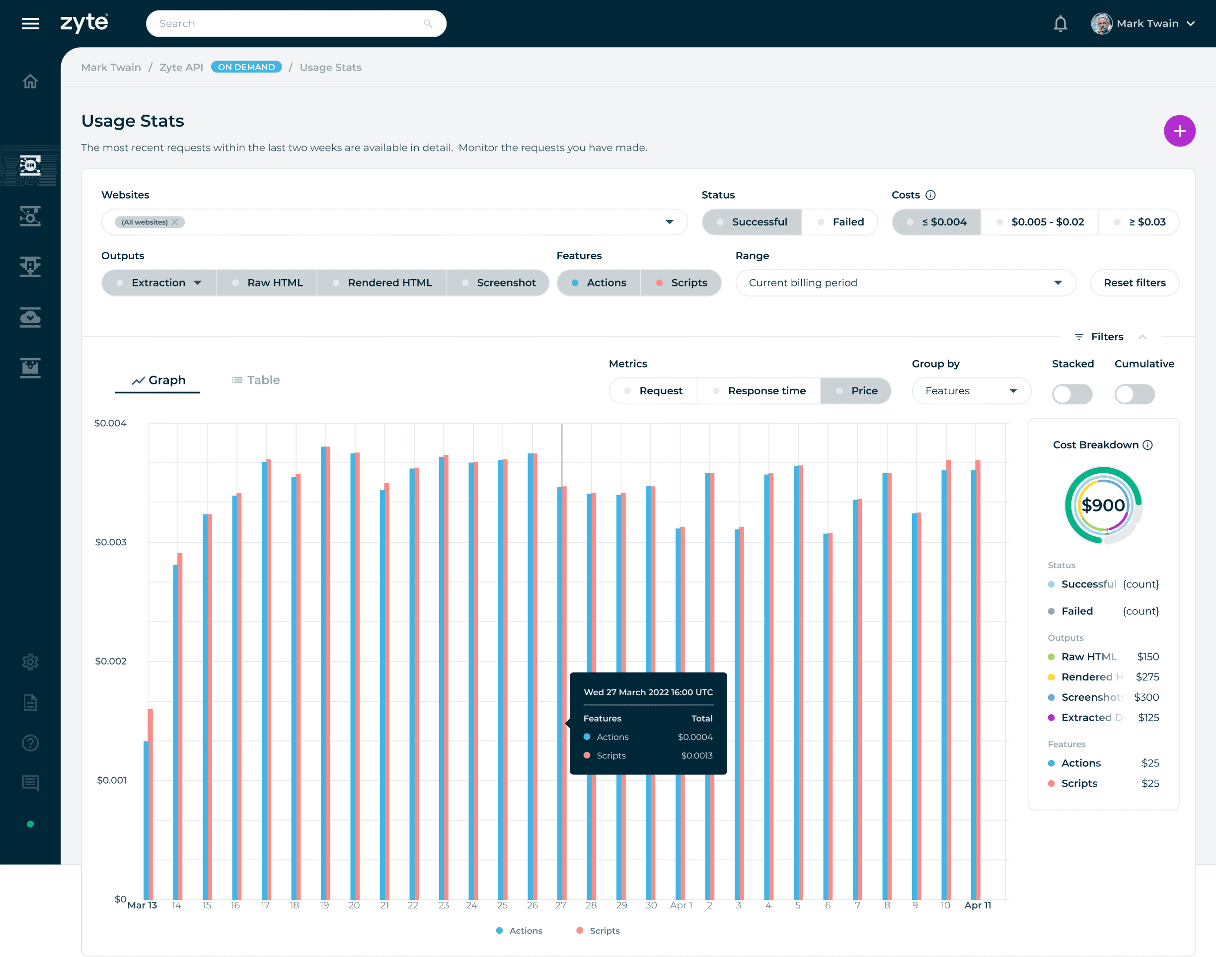
Non-cumulative: When cumulative is disabled using the toggle switch, the data displays the number of requests at each point in time defined by the selected time interval.
Non-cumulative: When cumulative is disabled using the toggle switch, the data displays the number of requests at each point in time defined by the selected time interval.
Non-cumulative: When cumulative is disabled using the toggle switch, the data displays the number of requests at each point in time defined by the selected time interval.
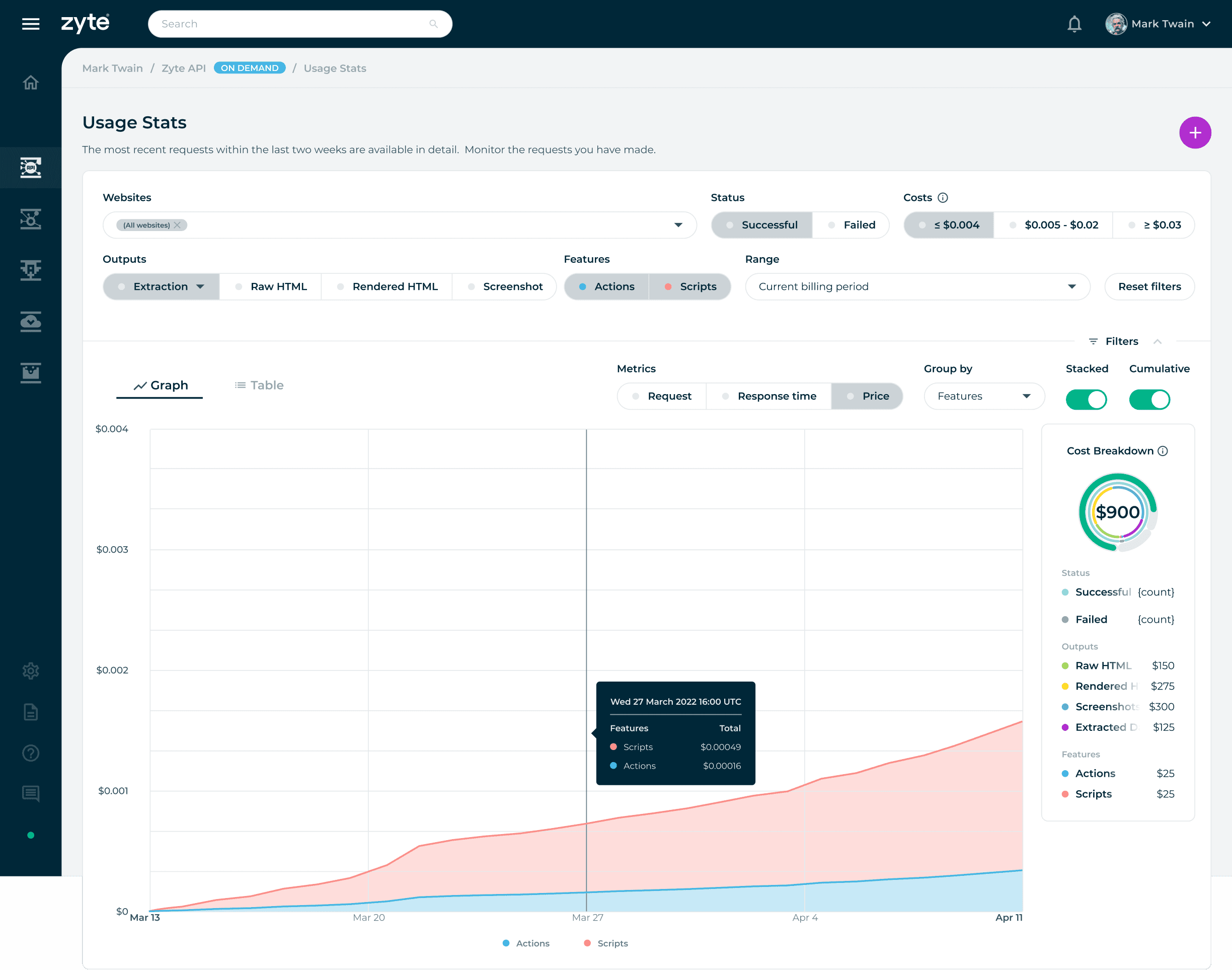
Filter setting: Show me successful outputs with extraction, including the actions and script features that cost less than or equal to $0.004. An additional filter setting is to show metrics in price, grouped by features presented in stacked and cumulative graphs.
Filter setting: Show me successful outputs with extraction, including the actions and script features that cost less than or equal to $0.004. An additional filter setting is to show metrics in price, grouped by features presented in stacked and cumulative graphs.
Filter setting: Show me successful outputs with extraction, including the actions and script features that cost less than or equal to $0.004. An additional filter setting is to show metrics in price, grouped by features presented in stacked and cumulative graphs.
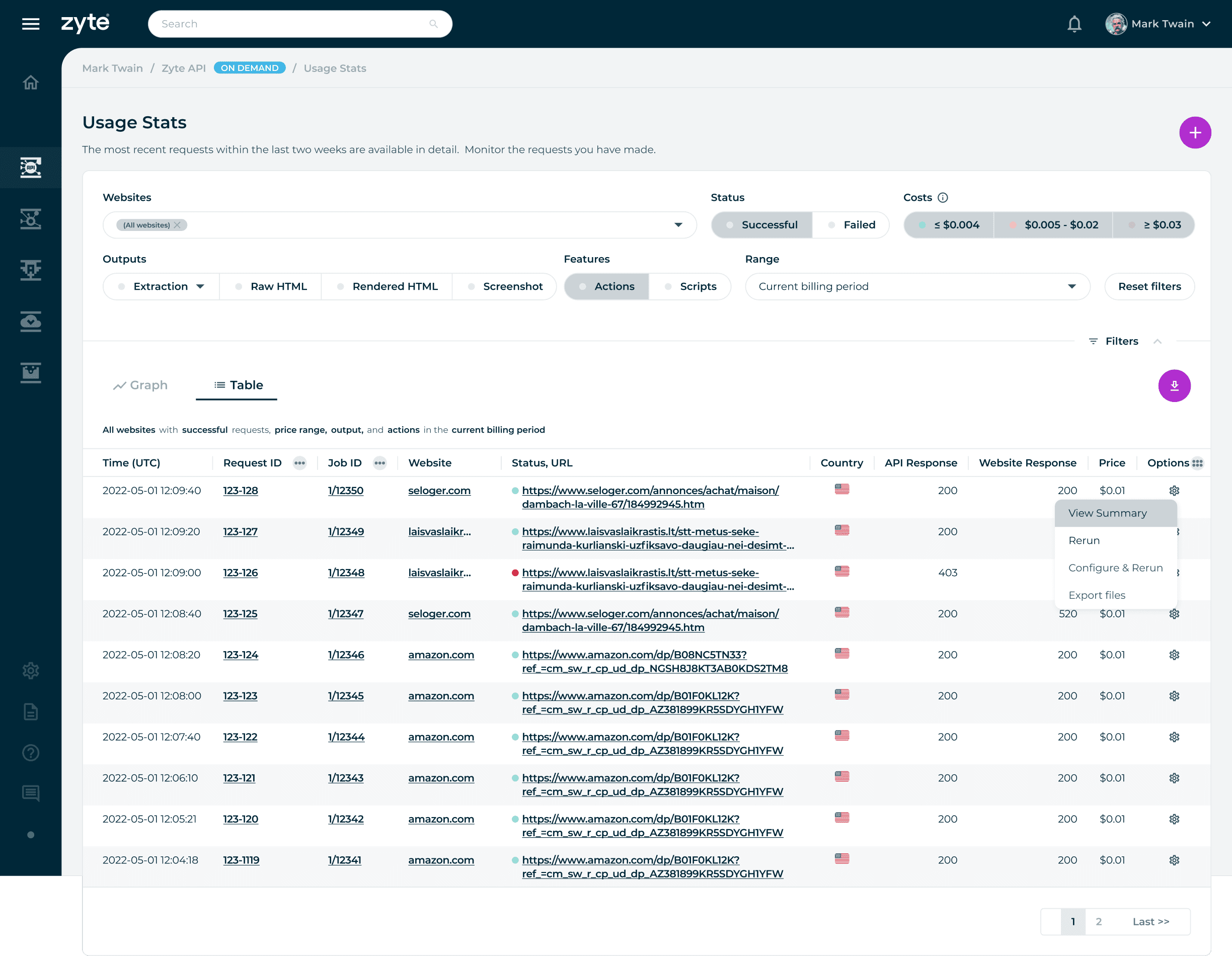
A table view is provided to users to inform them of their specific website request.
A table view is provided to users to inform them of their specific website request.
A table view is provided to users to inform them of their specific website request.
Conclusion
From Data to Decisions
By understanding the roles, activities, and goals of our users, I identified their challenges and create a tangible solution. The final design focuses on helping users move from observation to action, making it easier to identify trends and respond with confidence. Prioritized clarity and hierarchy to ensure key insights are always immediately visible.
Key Learnings
Designing for Data-Driven Interfaces
This project strengthened my ability to design dashboards that balance clarity with depth. It reinforced how visual hierarchy and structure can turn complex datasets into intuitive, actionable insights.
Key Learnings
Designing for Data-Driven Interfaces
This project strengthened my ability to design dashboards that balance clarity with depth. It reinforced how visual hierarchy and structure can turn complex datasets into intuitive, actionable insights.
© 2026 telo santos
© 2026 telo santos
© 2026 telo santos